Static elements are positioned according to the normal flow of the document, while relative elements are positioned relative to their normal position. Absolute elements are positioned relative to the nearest positioned ancestor but can be positioned anywhere on the page. And finally, fixed elements are positioned relative to the browser window
(most of the time) and remain in the same place even when the page is scrolled.

Understanding position: sticky
According to MDN(☞ link): “A stickily positioned element is an element whose computed position value is sticky. It's treated as relatively positioned until its containing block crosses a specified threshold (such as setting top to value other than auto) within its flow root (or the container it scrolls within), at which point it is treated as "stuck" until meeting the opposite edge of its containing block”
In simpler terms, a sticky element will act like a relative element until a specified threshold is reached. Once that threshold is met, the element will “stick” and remain in place, much like a fixed position element.
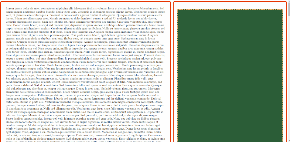
First working example
We can achieve a very minimalistic working example with the following code (let’s ignore the design classes):
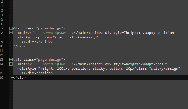
<div class="page-design">
  <main><!--  Lorem ipsum --></main><aside><divstyle="height: 200px; position: sticky; top: 20px"class="sticky-design"
    ></div></aside>
</div>
We can see the sticky element working as expected:
But sometimes it’s not that straightforward… Typically, we set the position: sticky and for example top: 10px for an element, but we may wonder why it doesn’t work.

Prerequisites
There are a few reasons why the position: sticky property may not work as expected. Some of the most common reasons include:
- The parent container does not have a fixed height or width: For an element to be “sticky,” the dimensions of its container should be specified. If the parent container does not have a fixed height or width, the element will not be able to “stick” to the top or bottom of the container.
- The parent element has an overflow set to hidden: The parent element of a sticky element must have an overflow value other than hidden, otherwise, the sticky element will not be visible
- The element has a fixed position: If an element has a position of fixed, it will not be able to “stick” to the top or bottom of the screen
- The browser does not support it: Not all browsers support sticky, so if you’re using an older browser, it may not work as expected. Also, some browsers may require the format:
position: -webkit-sticky - The
z-indexis not set correctly: if thez-indexof the sticky element is not set or set lower than other elements on the webpage, it will be hidden behind other elements. - The top, right, bottom, or left values are not set correctly
Stick to the bottom?🤔
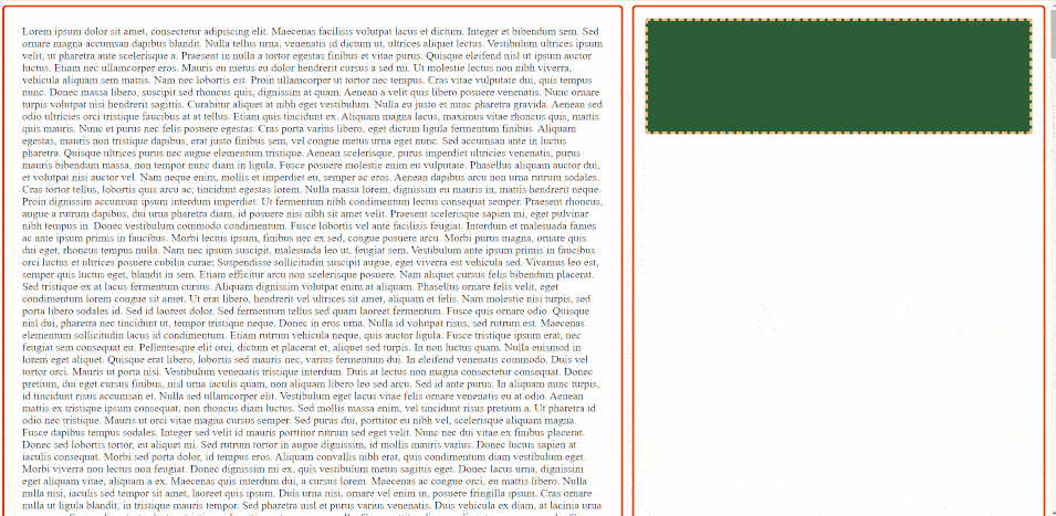
If you have double-checked all the prerequisites and were able to achieve a working example of sticking an element to the top, but it fails to stick to the bottom when you set a bottom threshold, what should you do? It may seem like it should work, but unfortunately, it doesn’t always work that way.
An important rule to keep in mind, as stated in the official documentation, is that using the sticky position will not automatically position the element to the top or bottom. Instead, it will determine how the element should “stick” to remain visible when the container begins to move out of view. To stick an element to the bottom, it must always be at the bottom of its container. One easy solution is to add another element before the sticky element, which will force it to the bottom. An example of this would be:
<div class="page-design">
  <main><!--  Lorem ipsum --></main><aside><div style=height:2000px></div><divstyle="height: 200px; position: sticky; bottom: 20px"class="sticky-design"
    ></div></aside>
</div>
In this case, we can see that the sticky bottom functionality works as we expected it to:

Scrollable / Twitter-like sticky
Now that we have all the necessary knowledge, let’s delve into this “magical” use case of the sticky position, which we will refer to as scrollable sticky. We are using this term because, despite the originator of this technique is unknown, it has been implemented seamlessly in the sidebar of the Twitter desktop site.
But, what is this exactly? In the previous examples, we saw the use of a sticky sidebar. However, those would not make sense if the sidebar content was larger than the screen height as the bottom (or top) of the sidebar would not be visible ever. Twitter solved this issue by implementing a workflow where the sidebar scrolls with the rest of the page while there is content in it. Once there is no more content, the sidebar stops scrolling and sticks to the bottom. When scrolling up, the sidebar again scrolls with the page and then sticks to the top.
How would you do this? It’s easy: when we scroll down, we set a top threshold to stick to the top, and when we scroll up, we set a bottom threshold to stick to the bottom. Congratulations, you made the same mistake that we did the first time. Try it out if you don’t believe us, but let us explain the problem with this approach: if you just scroll up and down a bit, the sidebar will jump instantly as it tries to stick to the bottom and then to the top, repeatedly. Our goal is to only stick the container when there is no more content left to scroll.
To achieve this we need to come up with a very clever and counterintuitive idea: using negative threshold values.
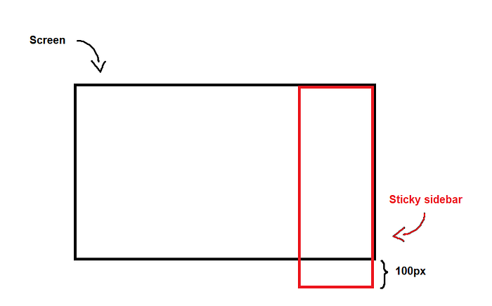
If the threshold is set to top: 0px, the sidebar will stick to the top and will not scroll, so the content in the overflowing 100px will never be visible to the user:
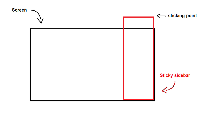
However, if we set the threshold to top: -100px, the sidebar will scroll until that point and will stick only after that. This is demonstrated in the following sketch:
This addresses all issues that arise when the user scrolls downward. When scrolling upward, the same process should be implemented, but instead of setting the top property, a negative threshold should be applied to the bottom.
Essentially, this is the core idea that needs to be understood. In a nutshell: negative thresholds must be applied to prevent weird jumps in the sidebar and to allow it to both scroll and stick once the content can no longer be scrolled. The exact threshold value can be simply calculated by determining the size of the overflowing portion (= sidebar height - screen height), but with a negative sign (ex. top: -100px). It is also crucial to remember that on a downward scroll, the top property should be set to this negative threshold value, and on an upward scroll, the bottom property should be adjusted similarly.
Wrap-up
In Angular, this entire workflow can be hidden within a directive, making it easy for developers to use. The directive takes care of all the calculations, so the developer does not have to worry about it. You can find the implementation and a demo of this directive here:
https://gitlab.com/krisztoferkunc/scrollable-sticky