Why the change?
When we started Adroit in 2019, we defined ourselves as a development agency building great websites and mobile applications for our clients. However, we’re always more focused on the techy parts because this is in our nature, this is what we love.
Over the last few years, Adroit has grown and evolved. We went through so many changes. Our team grew from 4 to 50+ employees, we started to work on interesting projects globally, and we narrowed down our services to what we do best. We shifted our focus to end-to-end project delivery and team augmentation, both paying attention to technical delivery. Also, as we know how difficult it might be for startups to realize their ideas – we have built, launched, and grown our own projects – we decided to give our expertise through technology consultancy services and development to purposeful entrepreneurs to help them develop winning products.
Both as individuals and as a company we’ve learned a lot along the way and started to feel that our brand identity wasn’t aligned anymore with our personality and growing company. We were so focused on providing our clients with exceptional solutions that we neglected that our brand wasn’t as strategic and modern as the work we delivered to our clients.
We thought that it was the perfect time to change that. So, we decided to rebrand and update our identity to represent who we really are today.
With the new visual identity of the brand, we try to communicate the change we’re going through, without going far from the results we achieved and experiences we gained in the past. The new brand should say to our existing and potential clients that both in development and consultancy we thrive in working on the hard technological questions and tasks.
What’s new?
After some back and forth with the brand agency - who we hired last year to draw out our personality and define our brand voice - and after hours of hard work to build the new website, we’re finally ready to introduce our new identity. Our branding is more than a logo change; it’s a way to express ourselves and the values we share – acceptance, freedom diversity, and quality.
While we maintained our original colors – green and black – we gave a completely new look and feel to our logo and our website.
We also introduced a completely renewed typography that helps create the modern look we were going for. The bold and playful Mortise that we use for the headings across the website is in great harmony with the classic and simple Inter on the rest of the page.
We also refreshed our illustrations and iconography. Instead of the line icons we used in the past, we went for pixelated images to showcase our team’s personality. We needed to realize that we’re big fat geeks, that’s it. We created a suite of single-colored, minimal, and easily adaptable icons by using the main element of the brand, a pixel (square).

A couple of icons we use on the website
A dynamic, modern, and technological reality expressed in every aspect, through the colors, new shapes, fonts, and styles that make the company's image more contemporary. This is who we are.
Our new logo
Our new logo is now modernized and it reflects our commitment to ongoing innovation. The logo represents the connection between our people and our technological background.
Also, the design of the logo was intentional. The customized ‘o’ and ‘i’ characters were created in a way to shape the well-known ‘0’ and ‘1’, an important element in the programming languages referring to the company’s services. (FYI in programming a bit - the smallest increment of data on a computer – can only have 2 values: 0 or 1.)
We went for an easily recognizable and well-known topic in a new shape. At the same time, it makes it easier to identify the brand faster, even in smaller sizes.
Adroit logo before and after the rebrand
It might look simple and easy, but believe me, we spent too many hours refining it. We went through and discussed tons of variations before making the final decision.
Our new website
We also launched a new corporate website to go along with our new branding. Here, you can find out more about Adroit, our services, technologies used, information about the team and open career opportunities, a portfolio of our work through various case studies, and you can read about a bunch of geeky stuff on our blog.
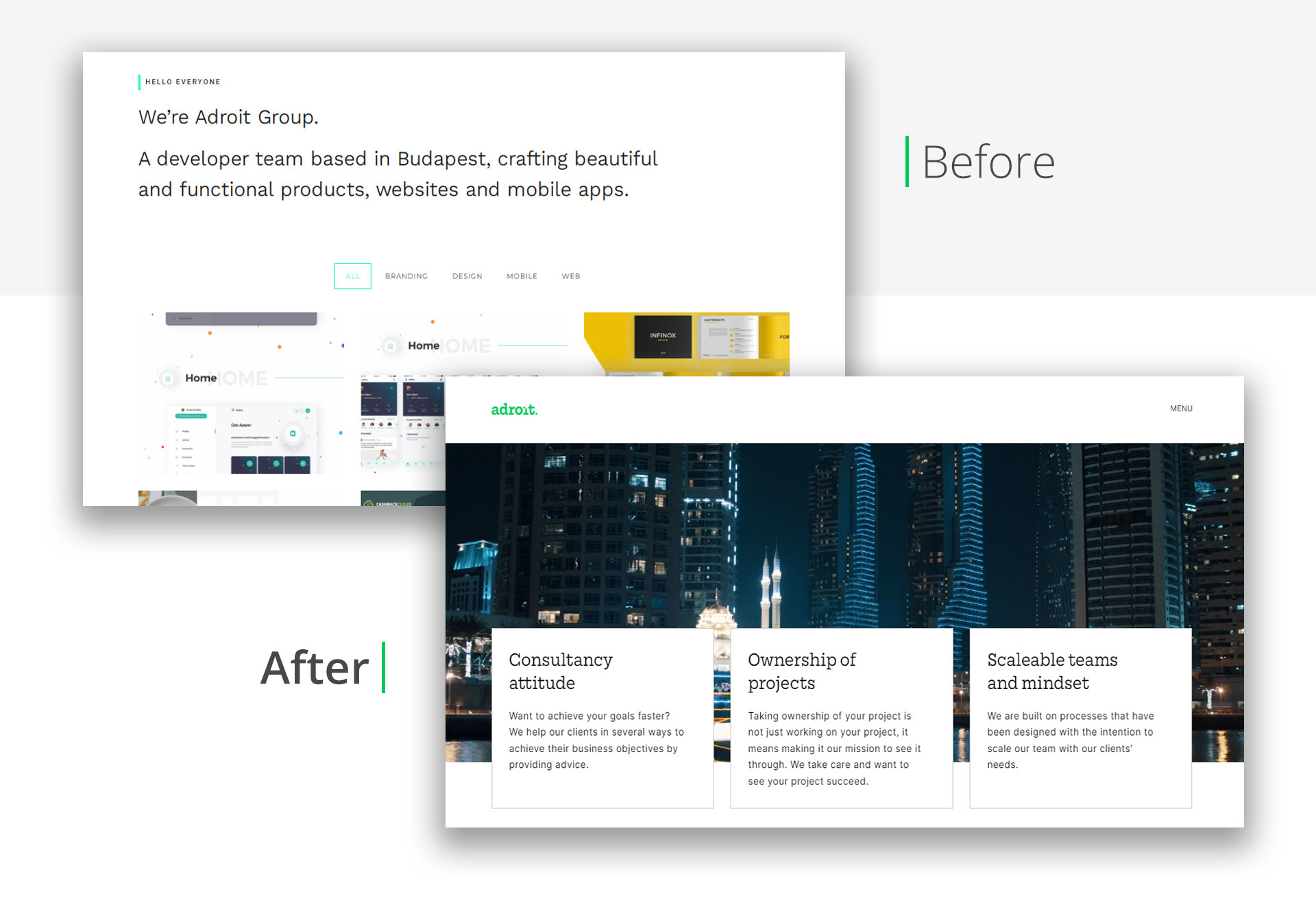
Adroit website before and after the rebrand
What’s next after the rebrand
Our new brand identity includes a more professional and consistent business style, which is already integrated into our new website, communication channels, and social media. We have also created our brand guidelines which you should consult when using the brand for consistency across the different channels.
This new brand prepares us for the big plans we have for the future. I‘m very proud of the work that we do at Adroit and I’m so grateful to our team and clients who have accompanied us in our growth. We have worked hard over the last year to transform into what we are now and I’m proud of what we have achieved as a team.
Now we finally have a brand that truly reflects who we are and can serve as a good basis to grow further. We are excited to share this journey with you, and hope you love our new look as much as we do!
Stay tuned, there’s more coming soon!